I generated Ti Boug's App Store screenshots with a Claude skill
On an App Store listing, the first image does more for your install rate than half your description. It’s the number-one conversion lever. And historically it’s a pain: brief a designer, endless Figma round-trips, or an evening fighting Canva templates that make your app look generic.
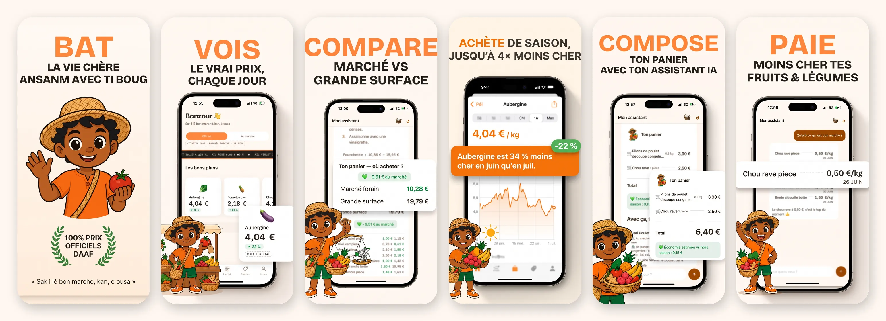
For Ti Boug — my anti-cost-of-living app for Réunion Island — I generated the whole set in one afternoon, with a Claude skill and Nano Banana Pro. Here’s the exact chain, and the traps nobody warns you about.
The skill: aso-appstore-screenshots
The starting point is an open-source skill by Adam Lyttle: claude-skill-aso-appstore-screenshots. A Claude Skill is a structured system prompt dropped into ~/.claude/skills/ that you invoke on demand, instead of re-pasting it every time.
This one doesn’t spit out random images. It enforces a product process in three phases:
- Benefit discovery. It reads your codebase, understands what the app does, and proposes 3–6 benefits that all start with an action verb. Not “features” — promises.
- Pairing. For each benefit, which real app screenshot best demonstrates it. It rates your captures “Great / Usable / Retake” and tells you what to re-shoot.
- Generation. A two-stage pipeline (the heart of it, below).
My 6 benefits, in order: fight the high cost of living · see the real price · compare market vs supermarket · buy in season · build your basket · pay less. One verb, one promise, one screen.
The real trick: deterministic scaffold, THEN AI enhance
The temptation is to throw a prompt at an image model and hope. It doesn’t work: on every screen the font shifts, the headline re-wraps, the phone frame changes. Six screens side by side that don’t match = amateur hour.
The skill’s answer, which I pushed hard for Ti Boug, is two separate stages:
Stage 1 — a deterministic scaffold in Python/Pillow. I lay out, pixel-perfect, myself: the brand cream #FFF8F2 background, the headline in Bricolage Grotesque (verb in mango #FF8A3D, descriptor in ink), the iPhone frame, and the real screenshot inside. Zero AI here. This is what guarantees consistency across the set: same type, same frame, same background everywhere.
Stage 2 — the enhance via Nano Banana Pro (gemini-3-pro-image). I send the scaffold + the mascot, and the model adds depth: a photorealistic straight-on phone, a soft shadow, and above all the breakout — a key card (the price, the saving, the −22 % badge) pulled out of the phone, scaled up, floating in front. That’s what makes the screen readable at thumbnail size.
The three traps that cost me the most
1. The AI reinvents text inside the phone — blur it
Nano Banana re-renders what it sees. The small French text inside the screen? It “copies” it by inventing words (“Produts”, “Bonñes”), drops accents, turns an eggplant into a lettuce. Unbearable for an app whose promise is price honesty.
Two fixes that work:
- A prompt clause that forces a blur (depth of field) on all small text: a sharp-but-wrong screen is a failure, a softly blurred one is fine.
- On the scaffold side, I crop off the bottom of the capture and replace it with cream: the list ends cleanly, there’s nothing left to invent.
2. One mascot per screen, never cropped
First pass: the same waving mascot on all 6 screens. Flat. I made it vary per screen, matched to the benefit: at the stall with a price-tagged tomato for “the real price”, holding his scale for “compare”, arms full of fruit + sun for “in season”, fist raised for the final win.
The technical trap: the final crop (9:16 → Apple’s narrower format) shaves ~10 % off each side. A mascot on the right = an amputated mascot. Fix: place it bottom-left, overlapping the phone, with a firm instruction — whole character, hat to feet, cream margin all around; if he doesn’t fit, shrink him. A small whole character beats a big cropped one.
3. A trust badge without lying
The big ASO temptation: “1,000+ users”, “#1 in Réunion”. Except the app isn’t launched — that’s a lie, and Apple guideline 2.3 bans misleading metadata.
The detail that dodges a rejection: dimensions
App Store Connect is strict about sizes. I generated at 6.7” (1290 × 2796), then derived the 6.5” slot (1242 × 2688) with a plain LANCZOS resize — the ratios are near-identical (0.4614 vs 0.4620), so no stretching. Two slots filled, one set to maintain.
What it teaches me
An image model alone doesn’t make a good app screenshot — it makes a pretty, inconsistent picture. What makes the set is the discipline around it: one benefit per screen, a deterministic scaffold that locks brand and text, and an AI confined to what it nails. The skill brings the process; the rest is framing.
Result: one afternoon, a set of 6 consistent, honest screens, ready for both slots — instead of a week of Figma or a designer budget I don’t have at build stage.
The skill is here, open-source. The app, Ti Boug, is the project I build in public: pulling the real price of produce out of the DAAF’s official PDFs, and putting it in Réunion pockets.
Sak i lé bon marché, kan, é ousa. 🌶️